GELLER DRAWING SET A POWERPOINT TEMPLATE KIT · 2026
Two documents went in. One system came out.
A capstone paper and a lunch-and-learn deck, built months apart for
different rooms, turned out to be reaching for the same navy, the same red and the same
two blue-greys — without anyone having written that down. This is what happened
when somebody did.
33PAGES ACROSS TWO FILES
2,611NATIVE SHAPES
0IMAGES
47NUMBERED PARTS
A TEMPLATE IS WORTH WHAT ITS REASONS ARE WORTH —
SO THIS PAGE IS THE REASONS
Handed the file alone you can see that a panel is grey and a chip is a
pill. You cannot see why red is only allowed once on a page, why the notch cut into a
ticket is the colour of the paper rather than the ticket, or which of the eighteen
values you are supposed to reach for. Six months later that is the whole difference
between a kit and a folder of shapes. Every number below was measured out of the file
itself; the two editable PowerPoints are the download at the foot.
01 WHERE IT CAME FROM SHEET 01 OF 08
The rule was: sample it, don’t invent it.
Two finished documents were already sitting on the same disk. One is
the MIT capstone — a
six-sheet drawing set about putting an agent between an executive and a hardware queue. The
other is Towing the Fleet
Forward, a lunch-and-learn deck about adopting AI without losing the people using it.
Different audiences, different years, no shared file.
They were still using the same colours. Not similar — the same navy for
a cover ground, the same red for a spine and a square mark, the same pair of blue-greys for
a panel that means “this is the governed option”. Nobody had decided
that; it had just happened twice. A system that has already emerged is a much
better thing to write down than one you sit down to design.
So every value in the kit had to be traceable to a page in one of those two
documents. Where a value is derived rather than sampled — three of the eighteen are
— the swatch below says so and says what it was derived for. Anything I could not
point at did not go in.
A system that has already emerged twice is worth more than one you sat down to design.
THE ONE RULE THIS KIT WAS BUILT UNDER
What a template does not do. It does not decide what you
are saying. Every string in both files is sample text — “Your name”,
“Panel heading”, “Chip label” — and the car-show wording on
the brochure boards is there because a real subject makes the parts legible, not because
the kit is about cars. Retype all of it.
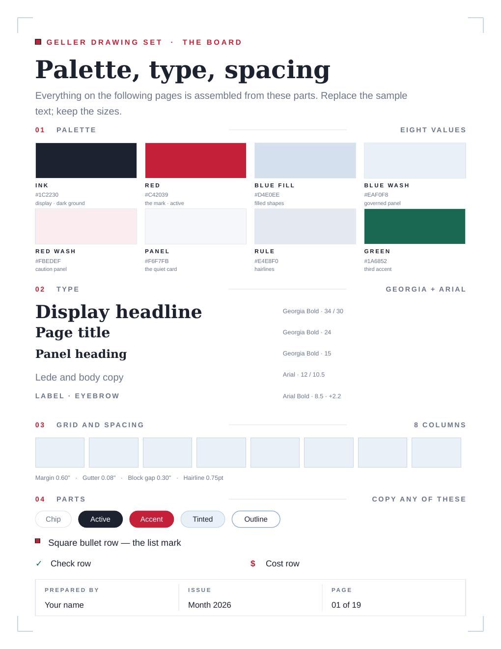
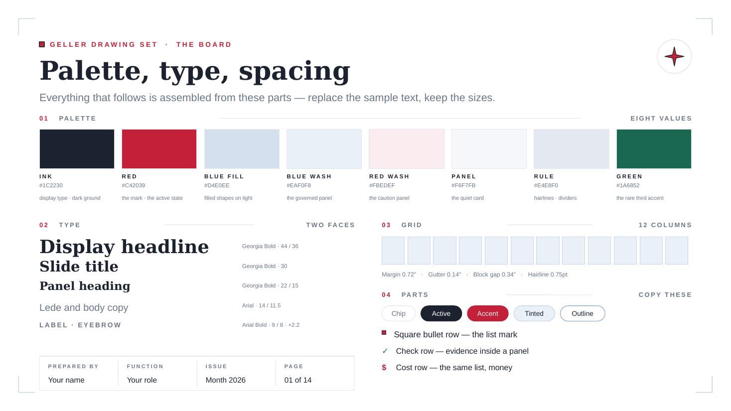
PAGE 01 OF EACH FILE IS THE BOARD — PALETTE, TYPE, GRID, PARTS.
READ IT FIRST; EVERYTHING ELSE IS ASSEMBLED FROM IT.
02 COLOUR SHEET 02 OF 08
Eighteen values, and the discipline is in how few of them get to do
anything.
Most of the palette is structure: grounds, washes, hairlines, and two greys
for type. Only three values carry meaning, and each one means one thing everywhere in both
files. Blue is the lane you are in. Red is the lane you are leaving. Green is
done. Red appears once on a page — that is why there is a navy ribbon as
well as a red one, and why the second callout on a page is ink rather than a second
accent.
FIG 01 THE PALETTE PICK A VALUE
GROUND AND INK
THE MARK
THE LANE
THE THIRD ACCENT
TYPE ON A GROUND
INK
#1C2230
Display type on light, and the ground of every dark page.
The capstone’s cover sheet. Sampled off the PDF rather
than picked.
THE TWO RATIOS ARE COMPUTED IN YOUR BROWSER FROM THE HEX ON THE SWATCH
— NOTHING HERE IS CLAIMING A NUMBER IT HAS NOT MEASURED.
Why the red has a second red
Click RED above and the instrument says 5.81 to 1 on paper and
2.74 to 1 on ink — under the 3-to-1 floor for large type, never mind
the 4.5 that body text wants. So there is a second red. RED LITE gets it to 3.95 on the same ground, which
clears headings and display. Neither one is a body-text red on navy, and nothing in either
file sets small red type on ink — that is the constraint, not an oversight.
Two values that look like one colour, because one colour cannot do both jobs.
Same reason there are two greys for captions: 6B7688 measures 4.59 on paper and
only 3.46 on ink, so the dark ground gets 8A93A6 and its 5.15 instead.
03 TYPE AND THE GRID SHEET 03 OF 08
Georgia and Arial — and neither is what the source documents use.
The capstone is set in Source Serif and Inter. The kit is not, and that is the
single most deliberate decision in it. A template that needs a font installed is a
template that gets opened once. Georgia and Arial are already on every Windows and
Mac and inside Google Slides, so the file is right the moment somebody double-clicks it,
anywhere, with nothing to install and nothing to go wrong on the machine you are not
sitting at. The real faces are a theme swap away for anyone who wants them.
FIG 02 THE RAMP, AND WHAT THE FILE ACTUALLY DOES
FIVE NAMED STEPS
Display headlineGeorgia BoldA cover, or the one line a page is about.
Page titleGeorgia BoldThe top of every sheet.
Panel headingGeorgia BoldInside a panel or a card.
Lede and body copyArialEverything that has to fit a box.
LABEL · EYEBROWArial Bold +2.2Letterspaced caps. The kit’s connective tissue.
Georgia · 14 sizes
4642403834323024232217161514
Arial · 13 sizes
13121110.5109.598.587.576.56
Georgia · 12 sizes
1485250424034302421191715
Arial · 14 sizes
1514131211.51110.5109.598.587.57
EVERY BAR IS ONE POINT SIZE, COUNTED OUT OF
ppt/slides/slideN.xml. BAR HEIGHT IS HOW OFTEN
IT IS USED.
The board says five steps. The file uses fourteen.
That is not a rounding error and it is worth saying out loud on the page that
is selling the thing. The ramp is five named steps, and the five do carry the work
— the census shows 24pt and 15pt doing most of the display and 10.5, 9 and 7.5 doing
most of the body. But a cover wanted 46, a section numeral wanted 38, a parts label wanted
7, and I let each of them have it. The honest description is a five-step ramp with
a long tail of one-offs, and the tail is exactly where a second person working in
this kit will make it messier. If you want it tighter, the census is the list of sizes to
delete.
FIG 03 THE TWO GRIDS ONE PER FILE
LETTER · 8.5 × 11
8 COLUMNS
Margin 0.60″Gutter 0.08″Block gap 0.30″Hairline 0.75pt
WIDESCREEN · 13.33 × 7.5
12 COLUMNS
Margin 0.72″Gutter 0.14″Block gap 0.34″Hairline 0.75pt
Two files, two modules. The hairline is the one number
they share, and it is the number that makes both of them look drawn rather than typed: every
rule in either file is 0.75pt, which is thin enough to read as a drafting line and heavy
enough to survive a printer.
04 THE BROCHURE PARTS SHEET 04 OF 08
Forty loose parts, and every one of them is a car show that isn’t
about cars.
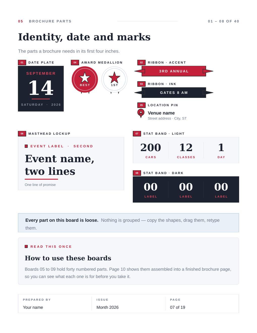
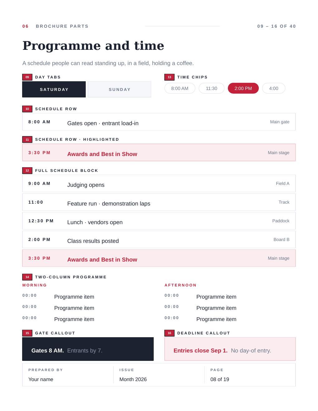
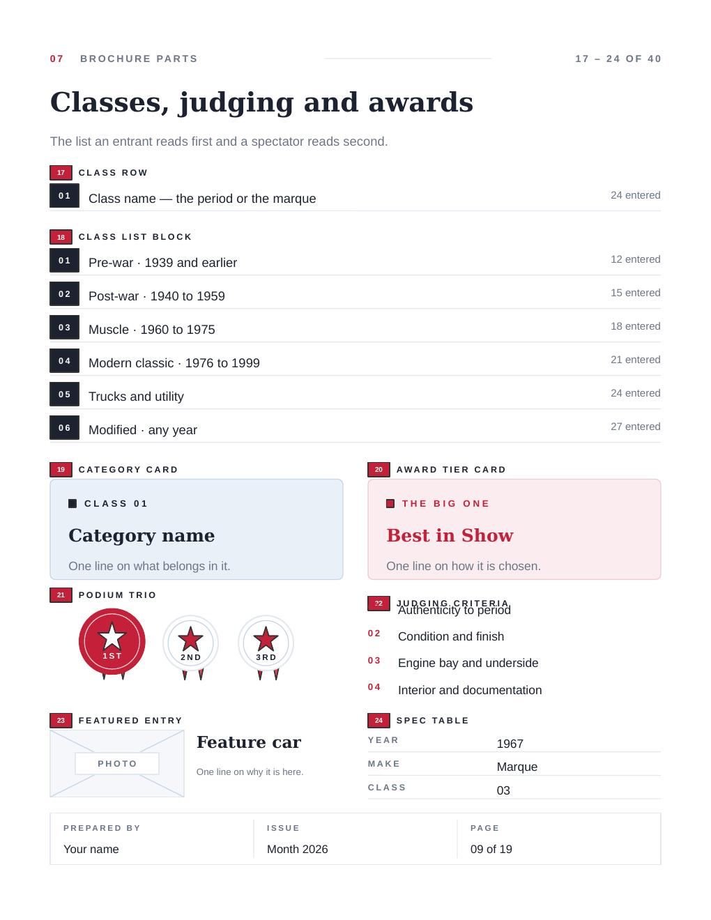
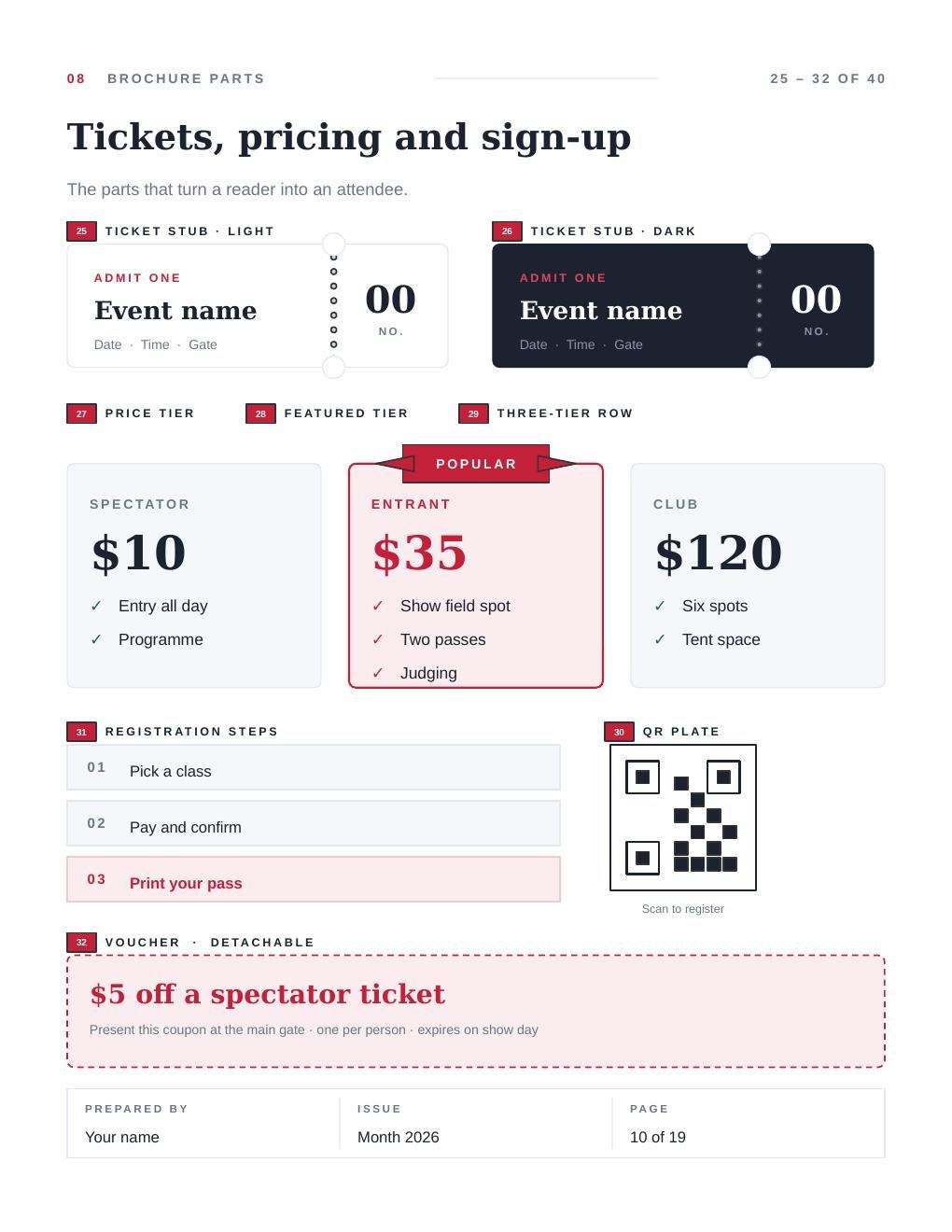
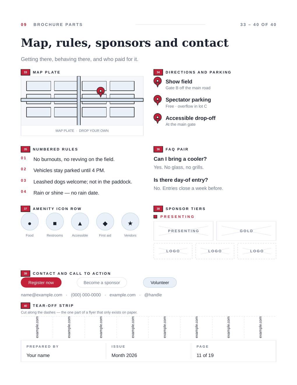
Five boards in the letter file hold forty numbered parts: a date plate, a
ribbon, a medallion, schedule rows, class lists, ticket stubs with real perforations, a
voucher, a QR plate, a block plan, sponsor tiers, a tear-off strip. They are drawn against a
car show because a part with real content in it is legible and a part full of
“Lorem” is not — but nothing in the geometry knows what a car is.
The date plate is a date plate for a wedding, a hackathon or a hearing.
Nothing is grouped anywhere in either file. A part is a handful of loose
shapes, so you marquee-select it, copy it onto one of the template pages and retype it. The
red number tag beside each part is a separate shape — lift the part, delete the
tag.
FIG 04 THE FORTY PICK A NUMBER
01 · DATE PLATE
IDENTITY, DATE AND MARKS
A calendar tile — month, numeral, weekday under a rule.
EACH NUMBER SITS WHERE THE GENERATOR’S OWN
tag() CALL PUT IT ON THE PAGE, IN INCHES,
CONVERTED ONCE. NOTHING HERE WAS PLACED BY EYE.
And one page that uses them
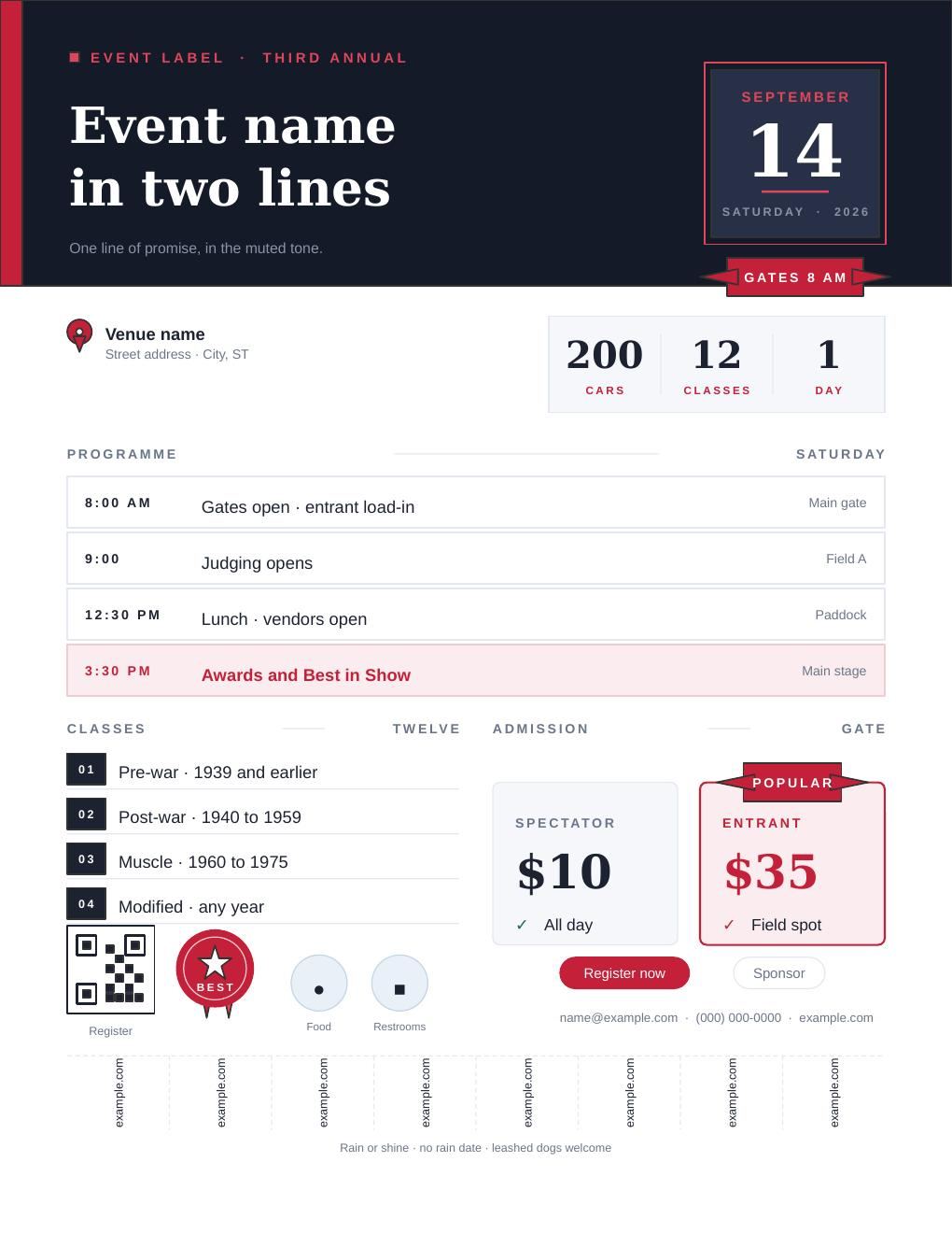
Board six is the same parts assembled into a finished brochure page, so there
is a worked example rather than only a bin. Overwrite the text and it ships.
PAGE 12 — THE PARTS FROM THE FIVE BOARDS, ASSEMBLED.
05 FULL-PAGE TREATMENTS SHEET 05 OF 08
Seven treatments that take the whole page, and each one tells you what it
leaves you.
Three borders and four accent fields. Every one of them is drawn on its own
page in the file with a dashed LIVE AREA box on top of it, because
a border whose safe zone you have to guess is a border you will fight. Delete the
dashed box before printing; it is a guide, not part of the treatment.
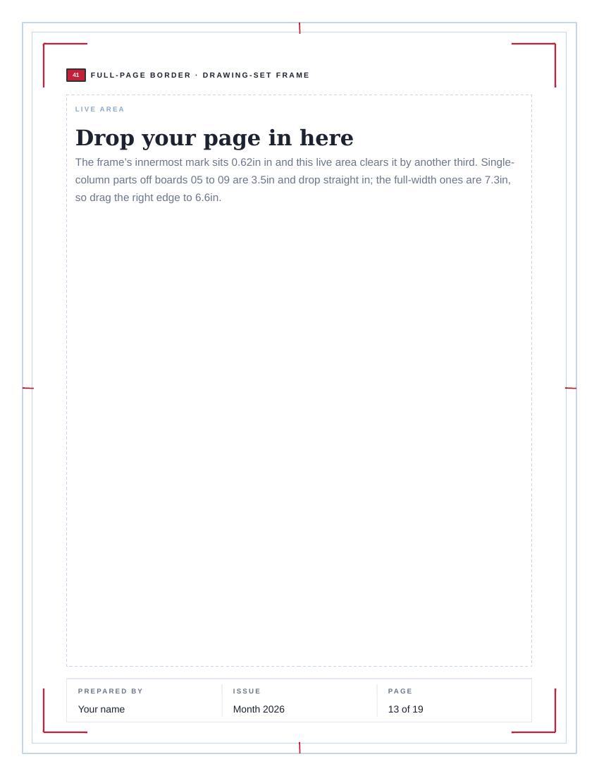
41 DRAWING-SET FRAME FULL-PAGE BORDER
Double hairline, red corner brackets, registration ticks at the four edge midpoints.
The brackets are eight separate lines, so you can keep two corners and delete two. The innermost mark sits 0.62in in; the live area drawn on the page clears it by another third of an inch.
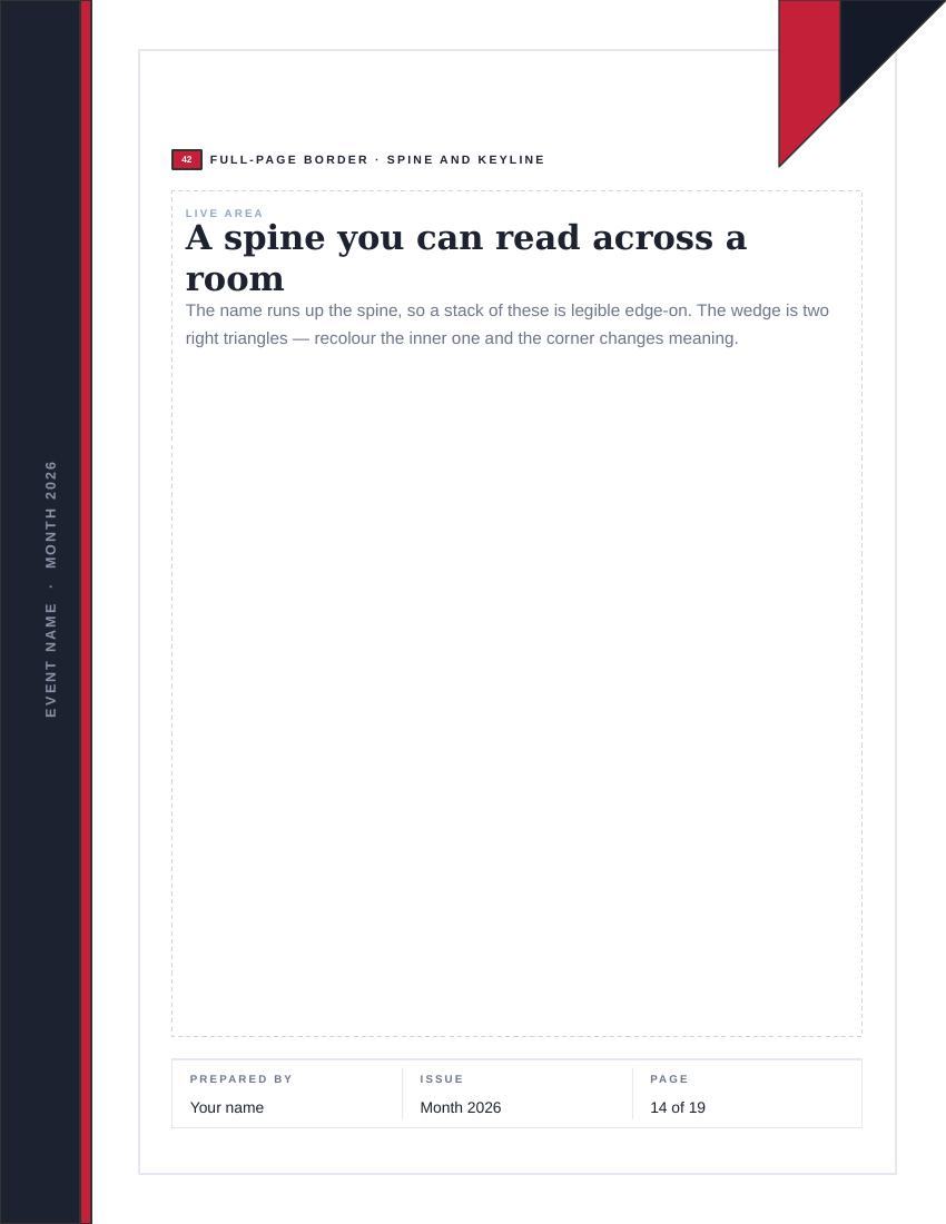
42 SPINE AND KEYLINE FULL-PAGE BORDER
A full-bleed spine with the piece name running up it, a keyline round the rest, and a two-tone wedge in the top corner.
The name runs up the spine so a stack of these is legible edge-on. The wedge is two right triangles — recolour the inner one and the corner changes meaning. Print with bleed, or drag the spine in to 0.25in.
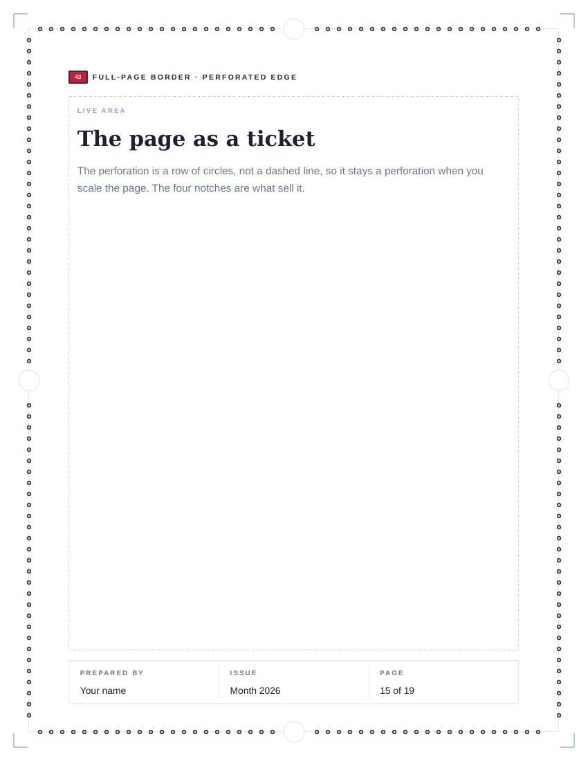
43 PERFORATED EDGE FULL-PAGE BORDER
The ticket at page size: a perforation of circles all the way round, notches at the edge midpoints, crop marks outside.
The perforation is a row of circles rather than a dashed line, so it stays a perforation when the page is scaled. The four notches are what sell it. For anything meant to be handed over rather than filed.
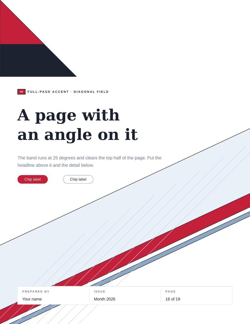
44 DIAGONAL FIELD FULL-PAGE ACCENT
One band at 25 degrees, a corner wedge, and a rake of parallel hairlines running with it.
Every piece is a rotated rectangle or a line — no image, no gradient, so it scales and recolours cleanly. The hairline lengths step rather than matching, because equal parallels put every end on one straight line and the field reads as a clipped rectangle.
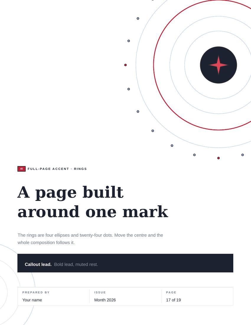
45 RINGS FULL-PAGE ACCENT
The badge, blown up until it is the page: concentric rings off the top-right corner, a tick ring of twenty-four marks, and a second family bleeding off the left.
Four ellipses and twenty-four dots. Move the centre and the whole composition follows it; delete any ring and the rest still reads.
46 BLUEPRINT GRID FULL-PAGE ACCENT
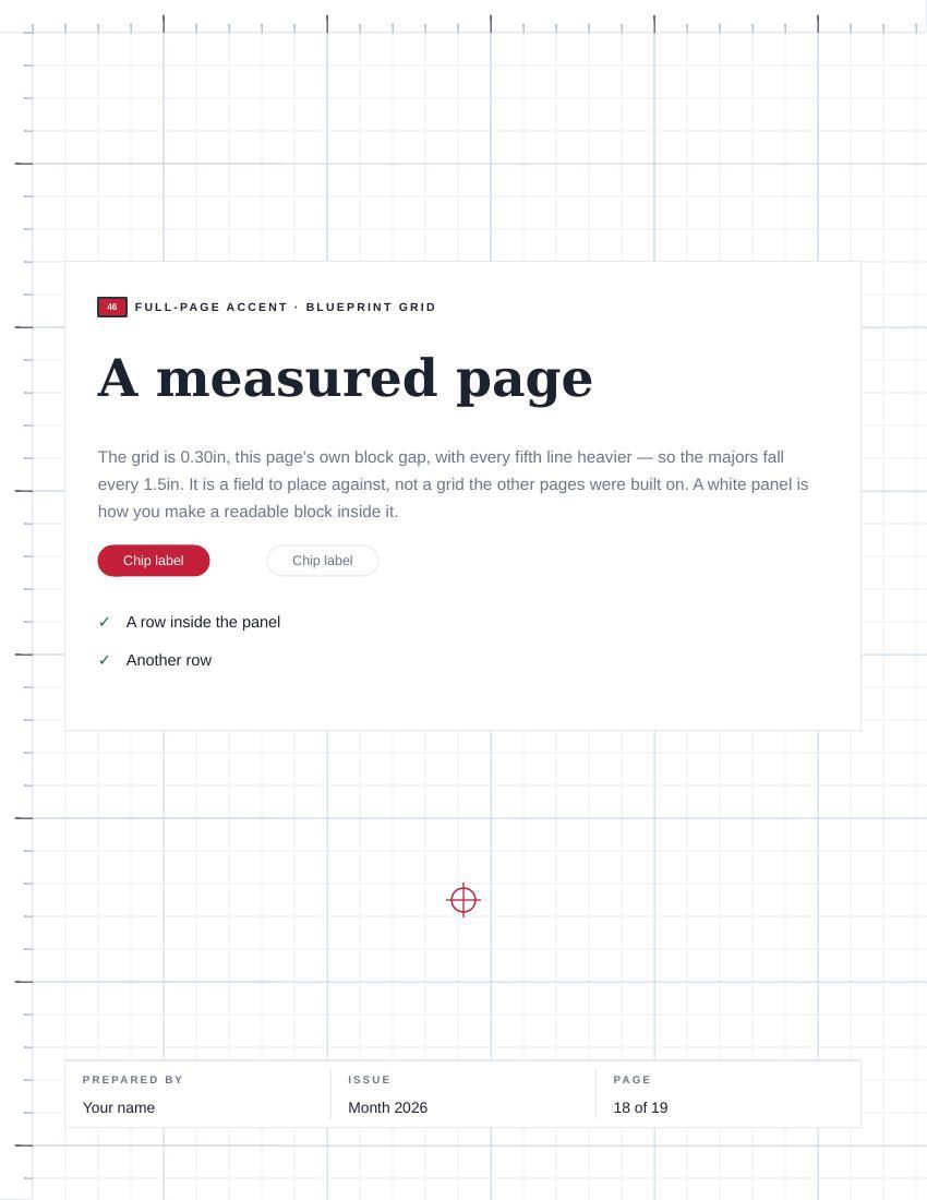
A measured field: a 0.30in grid with every fifth line heavier, a ruler down two edges, registration crosses at the quarters.
It is a field to place against, not a grid the other pages were built on — see WHAT BROKE FIRST. Drop a white panel on top of it for anything that has to be read.
47 HALFTONE FALL FULL-PAGE ACCENT
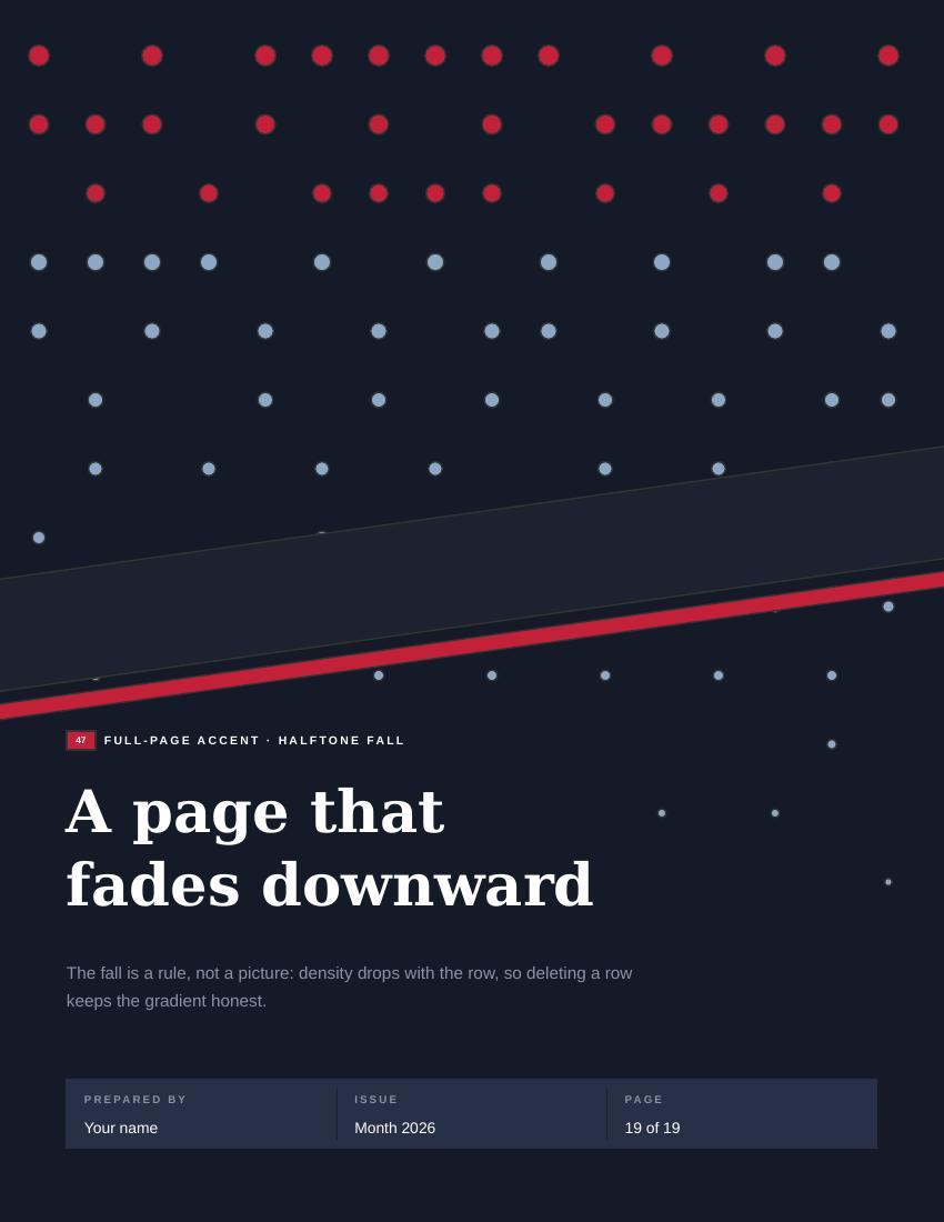
A dot field that thins as it falls, and one swept band, on the dark ground.
About a hundred and thirty circles. The fall is a rule rather than a picture — density drops with the row — so thin it by deleting rows, not by resizing. The type block is a keep-out: a dot inside a letterform is a speck, not a texture.
06 WHAT BROKE FIRST SHEET 06 OF 08
Nine things that were wrong before they were right.
Every one of these came out of looking at a render rather than at the code
that made it. Three rounds of that, on a file that validated clean every single time
— a file being well-formed and a file being correct are unrelated
facts.
A rotating object is contained by its centre and its half-diagonal, not by its box.
The medallion and the ribbon are rotated shapes. Clamp the bounding box and they still walk off the page, because the box is not what rotates.
A notch is a hole, so it takes the page’s colour and not the part’s.
The dark ticket stub had its notches filled navy, which read as a tab bulging outward — the exact opposite of a bite taken out of the edge.
Draw a tail before the ring it hangs off.
The medallion’s ribbon tails were drawn after the ring and floated a hairline clear of it. Z-order was doing the joinery, and nobody had told it.
A line shape with a zero secondary dimension renders full-page.
Four registration ticks came back as four rules across the whole sheet. Every tick now carries a 0.006in hair on its short axis.
Collinear ends read as a clip, not a texture.
Nine equal-length parallel hairlines put every end on one straight line, and the diagonal field looked like a rectangle someone had cropped. The lengths step now.
A halftone needs a keep-out zone over type.
Dots landed inside the headline’s letterforms, where a dot is not a texture — it is a speck somebody will try to wipe off the screen.
A body box computed as height minus header minus padding goes negative.
On short panels the copy ran straight through the border, because the arithmetic was never clamped and a negative height is not an error, it is just wrong.
Count the shapes in the packed XML, not in the generator’s own counter.
The generator reported 1,805 elements for the letter file. The file holds 1,803. Two builders were returning a count for something they had not actually added — and the number I would have published is the one that could not be checked.
Writing the page that explains a thing is how you find out the thing was lying.
Two claims in the shipped speaker notes did not survive being written down here. The blueprint grid said it was the module the parts boards were drawn to — the parts sit where the composition wanted them and no grid was enforced. And the drawing-set frame said everything on those boards fits inside it: the single-column parts do at 3.5in, the full-width ones are 7.3in on a 6.6in live area and do not. Both are corrected in the file you can download; neither would have been found by looking at it.
A file being well-formed and a file being correct are unrelated facts.
THREE QA ROUNDS, EVERY ONE OF THEM PASSING VALIDATION
07 THE FILES SHEET 07 OF 08
Both files, editable, free to take.
They open in PowerPoint and in Google Slides — upload, or File →
Import slides. Page one of each is the board. There is no licence and no attribution
required; if it saves you an afternoon, it has done its job.
Four things worth knowing before you open them.
Nothing is grouped anywhere, so every part comes apart. Every string is sample text.
The red spine on the dark cover and on border 42 bleeds to the edge — if your
printer cannot bleed, drag them in to 0.25″. And if you swap the theme fonts, swap
them in both files or the two stop matching.
THE SAME BOARD, IN THE WIDESCREEN FILE. ONE SYSTEM, TWO SHAPES OF
PAGE.
08 WHY IT IS HERE
SHEET 08 OF 08
The portfolio piece is the reasoning, not the shapes.
Anyone can hand over a deck of nice-looking components. What makes this a
piece of work rather than a folder is that every value can be traced to the page it
came from, every count on this page was measured out of the packed file rather than
remembered, and the two claims that turned out to be false are printed above instead of
quietly corrected. That is the same standard the rest of this site is built to, applied to
something that is usually shipped without any standard at all.